

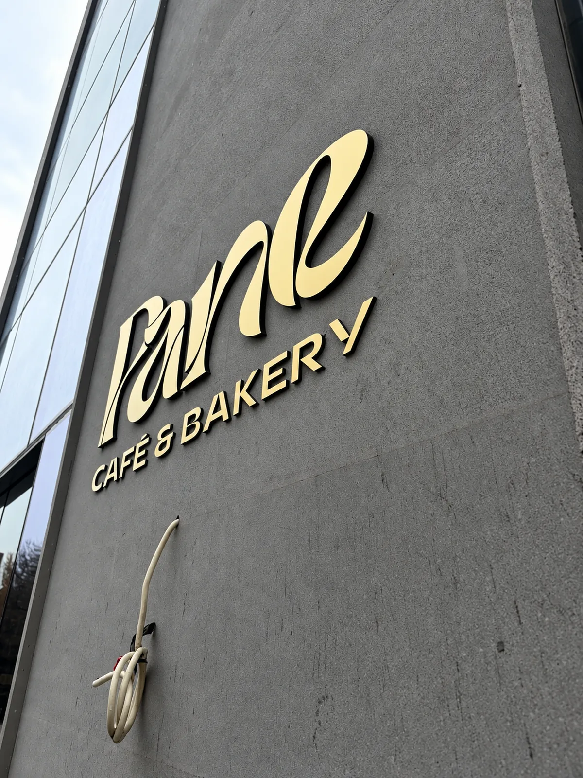
Gold-faced letters with black sides
This close view from below shows how the cafe's letters are built: gold faces at the front and black sides that give each letter visible depth. Set against the textured dark grey wall, the gold catches the daylight and the dark edges keep the outline crisp when the sign is seen at an angle.
 From the CONTURA portfolio

Let's make your
idea visible
Tell us what you have in mind. We'll talk through where to begin.